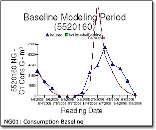
This is a graphical representation of the baseline model, showing the actual billed amounts against the model prediction. The triangular points show the natural gas consumption for each invoice used to create the baseline model. The red line shows the results of the meter baseline equation over the same period.
Theoretically, if the baseline equation was a perfect fit for the invoices, the lines would be on top of one another and we would have an R2 value of 1.0. That never happens in reality...the modeling process finds the best possible linear regression formula but it's never an exact match.
This example shows clearly that natural gas use is highly heating-sensitive. Gas use is almost nothing in the summer and increases dramatically in the colder months, which is quite normal for fuel meters.
Electrical meters are less predictable, because electricity is the most flexible form of energy. All of these situation are common:
| • | Cooling sensitive - Building is air conditioned electrically and heated with some other fuel. In this situation you would see summer peak on this graph, and a trough in the winter. |
| • | Heating sensitive - Building is heated electrically and has no air conditioning (winter peak with a trough in the summer) |
| • | Both Cooling and Heating Sensitive - Building is cooled and heated electrically (peaks in both summer and winter, with low points in spring and fall) |
| • | Weather insensitive - No electrical cooling or heating. |