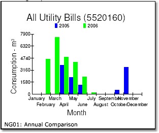
The annual comparison graph is a straight comparison of monthly billed quantities, for all of the data entered for analysis. There is no correction for billing period differences, nor for weather differences or any kind of change in building use.
The bar for any particular month and year reflects the invoices for any meter readings in that month. Normally each month shows a single reading and a single invoice, but sometimes a meter is read very early in a month, very late in the same month, and then not at all in the following month. In that case this graph will show a very tall bar for the first month and no reading at all for the following month.
The picture above shows natural gas consumption from April 2005 to July 2006. A quick look tells us that:
| • | There are several invoices missing (July/05, Aug/05, Sept/05, Dec/05, and Jan/06). ManagingEnergy can handle invoice data with gaps, so that doesn't mean that the meter model is invalid, however it's always better to have complete data. Where possible, we like to have a recent 24-month series of invoices to create a reliable baseline model. Invoices over two years old are less useful, because there is a good chance that changes in building usage over longer periods will be reflected in energy use patterns. |
| • | Natural gas consumption seems to have increased in 2006. Where we have a direct comparison (April, May, June), the consumption in 2006 is higher than in 2005. |